send link to app
Reporter App app for iPhone and iPad
4.0 (
4800 ratings )
Productivity
Lifestyle
Developer: ReporterApp Inc.
3.99 USD
Current version: 1.6.8, last update: 7 years agoFirst release : 06 Feb 2014
App size: 42.92 Mb
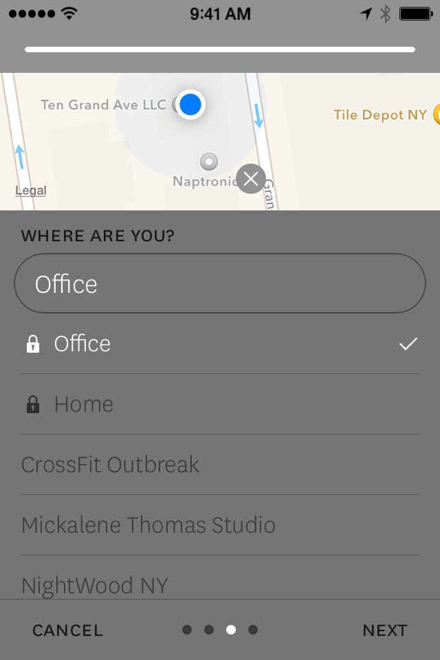
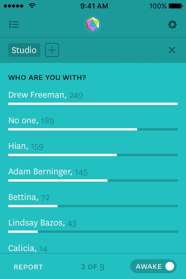
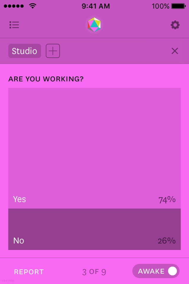
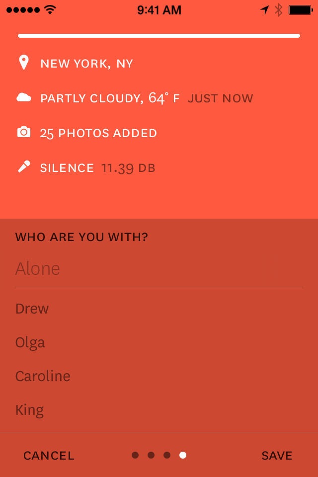
Reporter is an application for tracking the things you care about. With a few randomly timed surveys each day, Reporter can illuminate aspects of your life that might be otherwise unmeasurable.
*Step counting is available with iPhone 5s and later models
**Stair counting is available with iPhone6 and later models
Pros and cons of Reporter App app for iPhone and iPad
Reporter App app good for
Using it every day, one of the most useful apps to understand myself better. Great new filtering funktionality.
This app suits perfectly my self-quantifier’s needs. The execution is fast, the design is appealing, the UX is great and UI well thought (expect maybe for the toggle buttons — they make me want to swipe them… they should be replaced by checkboxes IMHO).
The ability to make it fully yours by customising questions/answers is a big deal. I like the fact they won’t store the data to their server but deliver it to your Dropbox. The kicker is truly the ability to fiddle with JSON or CSV data exports. As a developer interested in data visualisation, I couldn’t be more satisfied.
Well. Im marveled with this. How interesting is the perception of your day. You can no quantify your life.
And the Ux. God! Explendid. Im a Brazilian designers and guys, hands down for this minimalistic interface. Kudos.
Cheers from Brazil.
Am I suposed to remember to tur on and off when I go to sleep??
-.-
Great app! 5 stars now that I can change to °C
Must have for data freaks! :)
Best logging app on the AppStore; logging is really quick and simple.
Some bad moments
The app looks pretty but is a horrible user experience - confusing to set up and operate. And, most importantly, it asks you the same questions every time. It doesnt make sense to ask me how many coffees Ive had or whether I have worked out right when I wake up. Poor execution of what could be a great idea. Cant believe I paid over $3 for this!
Reporter App is a good app for surveying, not for reporting. You will find a perfect way to get questions asked, but the way you see your data is not very dynamic, versatile or intuitive.
It should be called "Survey app", because it is great at that.
For its price, it should be so much more than it is, I feel like Im paying for a startup instead of a finished app. And I definitely dont think the App Store is the place for that, there are other tools around the Internet to get that done.
useless app & uncomfortable. Better save your money for other apps!
Asks me the same 5 questions every day (and often at night) and shows some super basic visualization of it. Boring. The UI is not bad though.
The app states itll ask for a report randomly but never asks for the amount of reports set by the user.
Data is not displayed in any easily understandable or even readable way. Just a messy list of numbers letters and a line graph about coffee consumption?
The interface is very sparsely laid out. Its not very responsive and usually requires multiple taps before a touch point is activated. iOS 7 does a good job of making touch points easily understandable without buttons or borders. This app does not. If youre going to use non-standard UI elements at least do as good a job as the standard.
Whats probably even worse than the fact that the app simply does not work very well, sacrificing substance for style, is the incredibly poor taste in colors. The color themes provided are atrocious.
At least they chose a very nice typeface.
The concept of the app is brilliant and is what drew me to it in the first place. The actual app itself though needs much improvement. The UI is very flashy, however that makes up most of its substance. It should be easier to do reporting in this. When you are prompted it should actually take you to the reporting section with your questions. The Sleep/Awake function isnt designed very well. There should be something that shows you what mode it is in other than the text in the bottom right corner. Overall great idea but poorly executed in terms of design.
